All art copyright (c) Mike Kloepfer
"The level of achievement that we have at anything is a reflection of how well we were able to focus on it."
-Steve Vai

Saturday, May 31, 2008

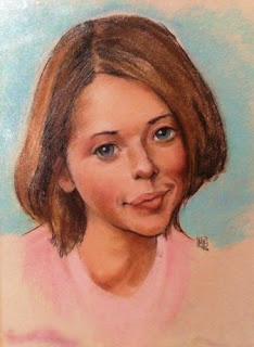
Doll Face

06/17/08:
My piece, 'Doll Face' has been included in the following tribute: [A TRIBUTE TO WATCHERS] May: Part 3 (Final) http://news.deviantart.com/article/50717/
Many thanks to Nano -
http://nothingreal0.deviantart.com/

This one gets its own post.
Thanks again to Nano
http://nothingreal0.deviantart.com/
for an awesome photo.

05/31/08
Today's entry:

As the previous day's paint dried, some of the colors 'sunk' and some stayed.
To start with tonight, I stood back and looked at the painting, and decided on a plan: unify the lights, smooth the transitions, intensify the dark accents.
I had BIG fun glazing in the deepest darks. It makes them just so damn...
MMM. Can't think of a word for it. Just when you think you have the darks as deep as they can go...

I also began to develop the tiny bits of background behind the hair, and the blue tips on the end of the hair.
As I worked, I spent more time stepping back and LOOKING. This helped tremendously (duh!) as well as helped to excite me to continue.

I'm diggin' this one. Is it possible to have too much fun?

05/29/08
The first day:

Smoke

05/31/08:
As I was driving home this evening, I saw this sight.
Smoke, acrylic, 4"x12"

There was a fire to the left of the highway, and the smoke drifted all the way to the horizon on the right, across long lines of treetops. The smoke cloud got redder as it neared the setting sun, much like pollution-caused sunsets. This contrasted with the grandiose white clouds in the far, far distance.


It struck me as visually interesting. I also thought how interesting it would be to do a landscape that included man's presence. [Like it's a new idea. lol]


I rushed home and sat down at the easel while the scene, and the colors, were still fresh in my mind.


The actual scene was considerably wider, I just got the idea down. If I choose to do this as a finished painting, I would probably make it a long, horizontal panorama.

Thursday, May 29, 2008

New painting studies

05/29/08
Finally back at the easel with brush in hand.
Here are a couple new studies.
Doll Face:

Acrylic, 5"x8"
This portrait study is from an awesome photo by:
http://nothingreal0.deviantart.com/
I loved the photo, and as usual I follow my gut. I just knew I had to paint this.
I've been jonesing to paint pale skin in cool light, using a high-chroma underpainting. My goal here is to capture the coolness of the light source, and the paleness of the skin, while still having the face look lifelike.

I used a limited palette; mostly Burnt Sienna, Burnt Umber, Ivory Black, and Gesso for the white; with the addition of Cad Red, Aliz Crimson, and a touch of Ultramarine in some of the bluest blues (but not much!)
The underpainting is Burnt Sienna, with a touch of Cad Red, lightened with Gesso (white.)
Love the expression, the eyes, the lips. Undt those hu-mongous eyelashes.
I haven't added the piercings yet, and there is still much to be done. It's a 'Work-In-Progress.'


Calm, 05/31/08:
I put a glaze of Burnt Umber/Yellow Ochre over the horse to tone down the blue highlights, which became obnoxious as the paint dried.

And this study from a great reference photo by:
http://colourize.deviantart.com/
Calm:

Acrylic, 5"x8"

I wanted to study the light, and the cool colors reflecting off the fur (do horses have 'fur', or is it just 'body hair'?)
Again using a limited palette; Burnt Sienna, Ivory Black, Gesso for white, with Ultramarine, Yellow Ochre in the background, and a touch of Aliz Crimson in places.

Thursday, May 22, 2008

COOL new addition to the studio!

Check it out!
After a dream about a floating skull in space, I set about collecting the hardware and wire, and installed this new addition to my studio.

It is very simple really. After looking around at hardware stores, I found this plant hanger in the gardening section of my local WalMart. The coolest thing about it is that it has a locking swivel, taking my original idea to a whole new level.
At first, I used two C-clamps attached to a shelf on the wall, but they pulled the shelf down, so I had to mount the bracket into the wall, which meant I had to go out and buy a stud finder. This presented unforeseen problems, because every time I got near the stud finder, I set it off ;)
I originally tried 12 lb. fishing line, but it snapped and sent Horatio tumbling, knocking out two of his teeth (one of which I didn't find until this morning.) By the way, having removable teeth in a skull is just plain stupid. They keep falling out, and I may have to resort to gluing them in place.

I ask you, how COOL is it to have a skull floating over your easel?

I am so excited to be able to utilize this cool new setup. Finally, I am no longer limited to what I can set up on a table surface. I can suspend Horatio, or for that matter, any object, in space. I can play with the lighting, the placement, tilt, etc.
Plus, I have recently been fascinated with the space surrounding the subject.
I believe this is going to be a real asset.
Hmm...

I think Horatio is about to make a comment.

Thursday, May 15, 2008

Pirate Self-Portrait is FINISHED!!!

05/15/-8
The pirate self-portrait is finished!
Here is a small version:

For a larger version and all the details, go to my pirate art blog:
http://nigelzart.blogspot.com/
or take this direct link to the post:
http://nigelzart.blogspot.com/2008/03/pirate-self-portrait.html

Saturday, May 10, 2008

RotaryFest Sidewalk Art Festival award!!!

Here are pix from the RotaryFest 2008 Sidewalk Art Festival.

There were a lot of really cool pieces by some very good artists. Go to http://www.floridachalkartists.org/ to see more.

I decided to do a piece with the macaws. I wanted to capitalize on the opportunity to paint large, and use intense, saturated colors. I also decided to trust my instinct and the fact that I have drawn these guys enough to be able to compose and render from memory. I brought reference sketches and a couple reference photos just in case, but composed the piece completely out of my head, "on-the-spot".
The piece went through several designs before I settled on doing one large, bold figure. The final piece, a portrait of Sunshine (my favorite scarlet macaw) won Honorable Mention in the "Originality" category.

The sidewalk and my empty square:
Gawd, it was a hot day.
First draft. I was originally going to do a piece with all eight of the new baby macaws from the aviary:
I put down a layer of baby powder as a base. I wound up laying it on too heavy, and it was a mess to work with.
Second draft. I brushed off the baby powder and enlarged the birds:
Third draft. I took a break, sat down and re-thought the piece. I really needed to work large, so I decided on a single bird. Large, bright, and fun. I went with Sunshine.
How appropriate. It was a bright, hot, sunshine-y day.
The final piece:
A detail:

and the award:

I would like to thank the Rotary Club for all their hard work in putting on a great event.
I had a fantastic time. This is only my second sidewalk art event, and I am learning a lot with each new endeavor.
But now, I am tired and sore, I have a shot of Captain Morgan's and a tub full of Mr. Bubble and big plans for both....

Friday, May 9, 2008

Park Sketches

These are sketches from the park. Some are live, some from photographs.

05/09/08:
Here is an old one from '06. This one has been laminated for use as a demo, hence the glare:

Pastel on beige paper, 12"x16"
I liked this one at first.
Then I kinda didn't like it.
Now I kinda like it again, but for different reasons; I like looking at it upside down.

See?

I bought the book on Alphonse Mucha's "Documents Decoratifs" His command of the linear element in his images is astounding. I was inspired to return to focusing on simply strengthening my drawing.
To that end, here is an unfinished drawing from yesterday:

I just loved the expression on this baby's face.
As I was drawing, I kept hearing Fat Bastard (from Austin Powers,) "He kinda looks like a baby!"
Conte pencil Sepia#617 and Nupastel Naples yellow on beige paper, 12"x16"

I am always trying new things, and revisiting old processes, trying to improve m process, and to prevent getting 'locked in' to habit:

Conte pencil #1355 and Nupastel Naples Yellow on Beige paper, 12"x16"