Now that I am digging into painting in oil, I have run into some issues with mixing colors. I found that if I'm painting the sky and sea, I simply need to have Cerulean Blue on my palette. I tried to mix it from other colors, but never was satisfied with the results. The straight tube color, when mixed with white, is so close to what I see as one of the major colors floating in and out of the sky – especially the skies I saw in Florida and the Caribbean. It also works for the skies in Colorado, although the colors tend to lean a little in the other direction, depending on the time of year and what altitude you're at. The skies of the Pacific Northwest tend toward the neutrals and grays, and California has its own personality as well.
As I traveled and moved around the country, I was fascinated with the way each sky has its own distinctive 'personality.' A good friend of mine who is a web designer said that when he moved From Seattle to Florida, his palette changed. He started using more aquas and oranges, because those colors were now so prevalent in his everyday reality. How true.
I spent a lot of time just looking at the sky and clouds, analyzing the hues and shades, and just getting a 'feel' for the color of the sky and the distinctive quality of the light. I could do that for days. I was particularly captivated by the skies in Florida, the way the clouds build up between the Gulf and the Atlantic, and the feel of the light and the atmosphere. I would drive down the highway with my camera on the steering wheel. One day I decided it would just be better to pull over and take pictures, then get back on the freeway. Good idea! LOL
Mixing Cerulean with French Ultramarine gives that perfect variation that makes up the bulk of the sky colors. Of course, there are countless variations, but I see those two colors as 'anchor colors' that the others are played against.
I could be wrong, but I don't care. It's my reality. I'll go with this until I witness something that convinces me otherwise... and I know it's probably out there waiting for me. LOL
I also really like the way the two colors vibrate against each other, especially when they are very close in value. Anything in addition to that is simply icing on the cake... (mmmMMMmmm...) Or perhaps a more accurate analogy would be that those two colors are the basic ingredients, and additional colors and variations are the spices.
I love blue. That's just the way I am.
So I picked up a tube of Cerulean Blue (Yes, HUE... it's what I could afford at the moment. I'll get the real thing in the near future when funds allow. Hey, some paint is better than no paint.)
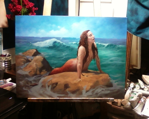
So the next logical thing to do is to see just how these colors interact with each other, and to test out the mixtures in the range I am attempting to get in the ocean and sky of my current painting.
Even though I have done numerous color charts in acrylic, I understand that oil paints will interact differently, and I want to get more familiar with exactly how they interact.
All the color charts I have done in the past have led me to refine and develop my ideas for organizing my approach to mixing color, to help make sense of the way the paints interact with each other, and to just get more mileage with the palette knife, to improve my ability to mix the colors I want. Otherwise, it gets simply overwhelming; after several colors get thrown into the mix, it gets hard to tell exactly what is going on.
I have come to the conclusion that the best way is to get as close as possible with an initial mixture of two tube colors, and to modify and tweak that mixture slightly to get the exact color I'm looking for.
Last summer I developed a chart for mixing between two raw tube colors, then mixing those up to a very light, near-white (number 1) value in a five-step scale. I added two steps of mixing the base mixtures with black, which gives me a full range of the way two colors interact. So this is the color chart I decided to use.
I started with the colors closest to what I was trying to mix in the painting. First up, Cerulean Blue and French Ultramarine. That takes it from the central Cerulean (which is slightly greenish) to the Ultramarine (which leans toward purple.) Next is to go the other direction (particularly for the ocean colors) and mix Cerulean with Viridian to get the Turquoise colors; then another with Cerulean and Naples yellow to get the greens.
Now I'm really starting to get a feel for the blues, greens and aquas in the sky and ocean colors.
What's next? Let's see... I need to get a handle on some of those neutral flesh tones, and then there's the colors in the clouds...
Eventually, I will do a color chart for every combination of colors on my palette. I think by then I'll have a pretty good handle on how to get very close to the color I want with as simple a mixture as possible. That's the goal, at least.