All art copyright (c) Mike Kloepfer
"The level of achievement that we have at anything is a reflection of how well we were able to focus on it."
-Steve Vai

Tuesday, April 29, 2014

Look, emulate, learn... and improve!


Sometimes it's beneficial (and fun!) to copy the drawing(s) of an artist whose work I admire. My goal is not to copy, but to learn - get inside the thinking process, and discover first-hand how they construct their drawings - to find out what's going on beneath the surface, so to speak.

I had been admiring the awesome comic artwork of Raul Moreno. So, I thought I'd take a page of his sketches for a spin.
04/28/14
Study of sketches
(after Raul Moreno)
Non-Photo-Blue Pencil
8 1/2 x 11"
Copy of character by
Raul Moreno
Blue ArtStix and Marker
11 x 17"
It's amazing how much more I appreciate his artwork, now that I have gotten down to the nitty-gritty and seen how well-constructed and well-thought-out his characters are. His linework is great, but it's the construction of the characters that allows his linework to really shine.

One thing I learned from the exercise is that the simpler and stronger the shapes of the underlying structure, the more the drawing holds together, the more 'solid' and convincing the forms, and the better the drawing - no matter what 'style' it is rendered in.


04/29/14
Character Sketches
(Penny Dreadful)
8 1/2 x 11"
Pen

Last night I watched the season premier of Penny Dreadful. I thought the show has some potential, and I liked some of the characters. So I sketched on them for a bit.
Victor Frankenstein
(Penny Dreadful)


After the Raul Moreno studies, I took another look at the sketch of Victor. I thought it could be much better, so I redrew it. This time, I paid attention to what I learned from the exercise.
And I think it was well worth the extra effort.

04/29/14
Victor Frankenstein
(Penny Dreadful)
Blue ArtStix and Marker
11 x 17"
Victor Frankenstein
(Redraw)
No-Photo-Blue and
HB Pencil
4 x 6"


Sunday, April 27, 2014

Horsin' Around with new paints and brushes!

I knew that I'd need to try the new Jo Sonja paints with canvas to get a real feel for how they work. I gotta admit, they are unlike any acrylic paints I've worked with. It will take some time to get the hang of it, but I'm thinking I'll like them. They have their strengths and their weaknesses, just like any medium. And boy, were they ever right when they said "Once the paint gets tacky, just let it dry." The 'open time' is great, and the consistency is super nice - once you get the hang of how to use them.
Once again, I am working with only Burnt Umber and Warm White. It makes for a nice tonal study painting. 
The major lesson I learned today: Clean your brushes between values!
"Be lean and mean - clean in between!"
04/27/14
This is a good stopping place
for tonight.
I'm posting these in reverse order, with the most recent pic first:
04/27/14
Step 5
04/27/14
Step 4
04/27/14
Step 3
04/27/14
Step 2
04///14
A decent start.
Thanks to Chris Legaspi for his
online critique - "Design your values
for your purposes."


Saturday, April 26, 2014

Testing out some new paints and brush

I used a small portion of my tax refund to stop by Creative Possibilities and purchase some art supplies.
I love the place, and the folks there are super-awesome.
I picked up a couple tubes of the Jo Sonja Artist Colours acrylic paint (Burnt Umber and Warm White,) and a Loew-Cornell 7040 Round Stroke #2 brush. I have been excited to try them out.
Here is a little tonal study I did using the two colors (Burnt Umber and Warm White) and the new brush, along with a couple of my trusty flats where needed.
Here is what I ended up with. 
I may go back in and work the background a bit, and fiddle with a few details, but I am pretty happy with the paints and the new brush.
I like this paint. It is very 'buttery' coming out of the tube... and it appears to have a long 'open' time. Of course, painting on paper definitely affects the working properties of the paint. I will have to try it on canvas next to really see what it's like to work with.
Looking Back
Acrylic on gessoed Watercolor Paper
5x7"


Thursday, April 24, 2014

An artist's point-of-view...

When most people see a photo like this,
they see an underwater photo of
a sea bird catching a fish -
a curiosity of nature...


I'm not like most people.
I see...
A Dragon catching a Great White Shark!

Sketchbook additions


04/21/14
Caricature sketches/variations
of old couple

04/22/14
WH40K sketches

04/23/14
Misc sketches
(Yes, that's a pug that looks
like a loaf of bread.)

Saturday, April 19, 2014

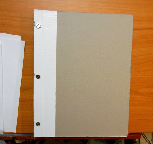
THE NEW SKETCHBOOK


I assembled my new sketchbook, inserting a couple different types of paper, drilling the holes and mounting the posts. Now it's ready to take for a spin!

04/17/14
The New Sketchbook

04/18/14
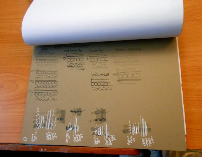
Trying out a variety of pens

04/18/14
Trying the pens on the toned paper


Wednesday, April 16, 2014

Another page of sketches

Word to the wise: Be careful with your coffee cup!
04/16/14
Misc Sketches -
Architecture, Art Deco,
Animal skeletons,
Mechanical bugs,
Knobs, Lamps, etc.

More from the sketchbooks!

I am  directing my sketchbook time toward gaining more relaxed, confident, and accurate linework;  at the same time I am focusing on letting my thought process become more open and experimental.
To that end, I have been taking time to sketch whenever I get ideas - which is a lot lately.
I have run across some cool stuff, and one idea always leads to another. For instance, looking at mechanical sketches of a prototype helicopter gave me an idea for an architectural 'bubble' element to add to another scene I have been working on; of course, dinosaurs are always good reference for sketching dragons; Art Deco is fascinating to explore in terms of just plain cool design, which can apply to just about anything; combining Art Deco with pictures of Egyptian jewelry gives me ideas for vehicle/mechanical/spacecraft sketches;
And honestly, who could resist a suit of armour made out of bicycle tires? (see the photos here.)
04/11/14
Dinosaur sketches

04/14/14
Armour sketches
I saw pix of a suit of armour
made out of recycled tires.

04/14/14
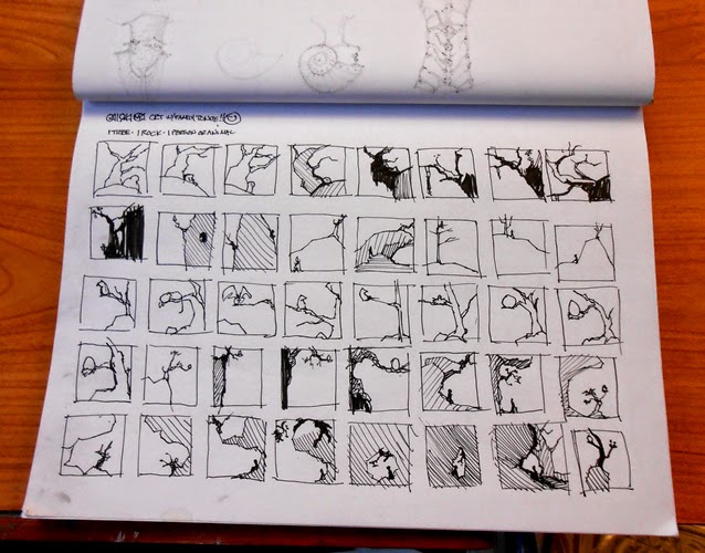
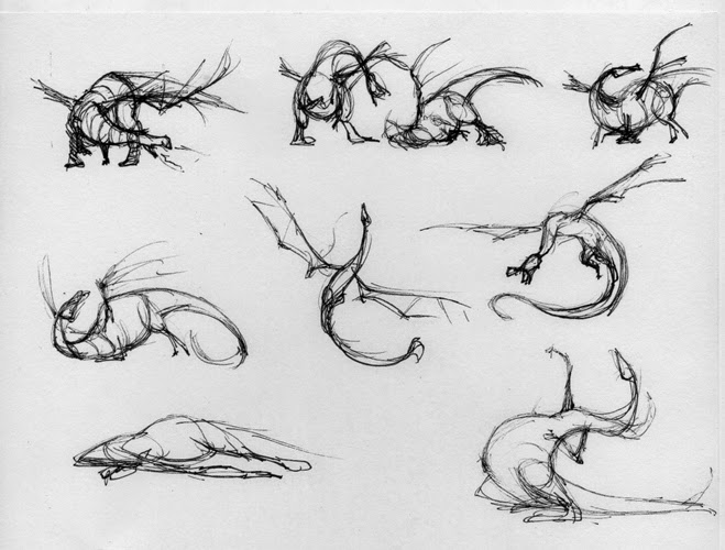
Scene thumbnails and
Dragon sketches

04/15/14
Jewelry, mechanical and
pseudo-architectural sketches

Tuesday, April 15, 2014

New speaker!

The new addition...
Color coordinated! Top - bottom:
X-mini speaker,
Wacom Bamboo pen
with Lime Green duck tape,
Pen-Pal pen holder
attached to Wacom tablet.
(Yes, that IS paint
all over the table top.)
Sometimes it's the little things that make your day. Literally.
I always make a point to take advantage of whatever unique opportunities my job-at-the-time presents.
So when the X-mini speakers went on clearance for $1.00, I couldn't resist! I chose the lime green - my current accent color and answer to the all-black-studio-dilemma (see my post: Black is the New Pain-In-The-Ass)
When I got home and hooked it up, not only did it sound great for a tiny little speaker... I was delighted to see how color-coordinated it was with the rest of my setup.I love it and think it looks super cool.
I know - it's a small deal - but it still gives me a little thrill when I see it. :)
[Another bonus from work: My Wacom stylus was always rolling off the table... The (lime green!) Pen-Pal, a handy little office-supply-item,  keeps my stylus handy, yet out of the way.]

Wednesday, April 9, 2014

Painting Demonstration for Golden High School art class


Donald Sutherland, from
The Great Train Robbery
Tim Miller is one of my friends from school days. He is an art teacher at Golden High School (see this story.) He invited me to do a painting demonstration for one of his art classes, who are doing a portrait project in Acrylic.
The students were great, and their own artwork is awesome. I am blown away by the level of artistry of these high school students, and excited for them.
I searched around for a good reference photo, with a face that had a good 'sculptural' quality. I originally thought of doing a portrait of Peter Cushing, until I discovered that the photo I was going to use was not a photo at all, but a 3D render... and a really good one! But a digital render was not the right reference for this demonstration, as it would mean re-interpreting another artist's interpretation, if you know what I mean.
Then I found some photos of Donald Sutherland, who I have always thought would be fun to draw or paint. He has a very interesting, distinctive face. That's when I stumbled across this photo  of Sutherland from The Great Train Robbery.Wow, how cool. A great actor, a great costume, and a pretty good photo.

An hour isn't enough time to complete a painting (and more's the pity, eh?) So I decided to show some of the basics and concepts that I use when mixing colors.  

I enjoyed the demonstration, and I like the actor, the costume, and the photo, so I decided to follow up the demo by finishing the painting and posting step-by-step photos.  There is a lot to do with the piece to finish.
This should be fun. :)

04/09/14 in-class demo
Initial values and colors
04/09/14 Back in the studio
Light wash of Yellow Ochre
to warm the face.
Develop structure around
the (left) eye, cheekbone,
and forehead.

Thursday, April 3, 2014

Skulley2 in Gouache revised.

I've had the Skulley2 Gouache poster study sitting in the studio for a few days. I kept looking at it, thinking that the whole thing looked too dark. Then it occurred to me that by toning down the top surface of the table, the rest would not seem so dark by comparison, and since the highlights would now be the lightest value, it would allow them to stand out.
04/03/14
The revised study
Skulley2
Gouache, 5x7"

03/25/14
The original study
Skulley2
Gouache, 5x7"


Wednesday, April 2, 2014

...and still more thumbnails...

04/03/14
Scene thumbnails
Pen, 2x3" and 1"
04/03/14
Dragon thumbnails, Pen
03/30/14
Horse sketch, pen, 3 x 2"
03/30/14
Faces thumbnails, Pen, 1"
Pushing shapes around the square.
03/31/14
Composition thumbnails
Pen, 2 x 3"
I saw a composition that
intrigued me and related
to a current idea I've been
playing with, so I tried
working through the idea.
03/31/14
Composition thumbnails
Pen, 1"
The only thing to do is to
'run it through the mill.'

03/31/14
Gnome and dragon thumbnails, Pen, 1"
Playing with shapes.