This morning I woke up out of a sound sleep with the urge to post the exercise, and the printable documents, on my blog for all of my fellow artists to experiment with and enjoy.
I first got the idea when watching the video podcast series Little Creatures from Bobby Chiu. (I love Bobby's creature designs, and I thoroughly enjoy his pod casts, watching him draw and listening to him talk about his ideas, process, etc.)
 |
| Bobby Chiu - Little Creatures Part 1 of 3 Click HERE to see the first video (I highly recommend it!) |
 |
| Little Creatures Part 2 of 3 Click HERE to watch the video |
 |
| Little Creatures Part 3 of 3 Click HERE to watch the video (The bonus of watching the videos is Bobby's inspirational talk about not giving up!) |
The process of thumbnail sketches is nothing new; however, his is the first time I have found a way to approach it that works for me.
The great thing about this exercise is that it is FAST. I can knock out a whole page of thumbnails in a very short time. And by doing so, I can try out as many variations on a theme as I can think of - and I was surprised how many I could think of!!! It really gets my creative wheels turning. And since the images are so small, there's no room for excessive fiddling around. Just get the idea down.
It's all about the broad, general shapes, overall proportions, the design, and the balance - not about the details.
[When the overall design is solid, the details you choose to include have more impact. It allows you to be much more selective about which elements you really want to include in a piece, and the entire piece becomes more compelling.]
My initial goal is to fill an entire page with a single idea or concept - that's 48 thumbnail sketches! It's much more constructive to pick the best from 48 tiny sketches than it is to just 'steamroll' through the first idea that pops into my head. Sometimes, the first idea is the best, sometimes it isn't. This way, I have options - lots of them! Sometimes, the idea that should not work at all winds up being the one that I like the best.
Filling a page with a single idea is not always easy. Sometimes, one idea leads to another, and that leads to another... When that happens, I just follow the flow. That is when it gets really fun! In an hour, I can come up with several brand-new ideas or concepts, and dozens of variations of each one. This leads to some cool "ah-ha!" moments. It's fun to see where ideas lead.
Now, when I have an idea or concept that I like, I can run it through this process and work through all the variations, permutations, good ideas, bad ideas, boring ideas, brilliant ideas... until I come up with enough thumbnails to pick and choose the one(s) that will be the best to continue developing.
Here is GRID 1:
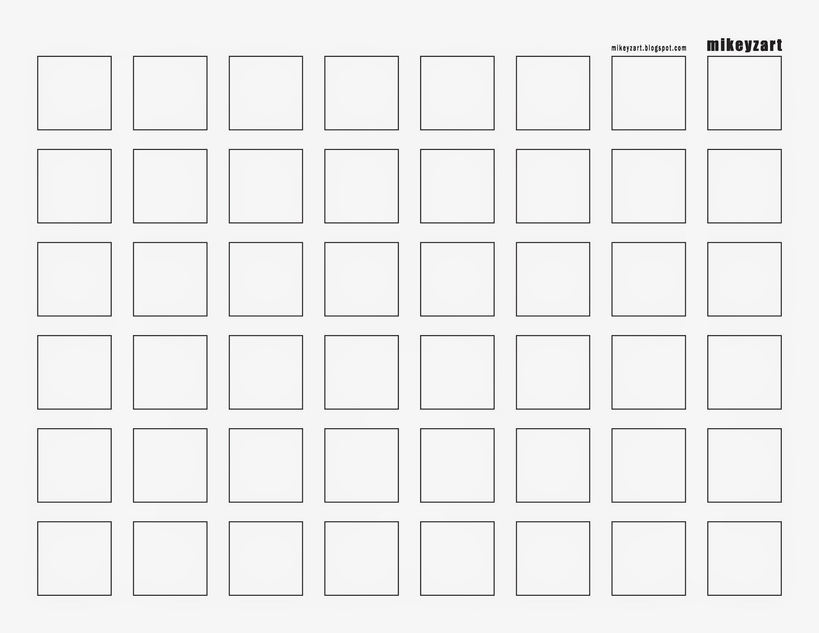 |
| Grid 1, aka The 1x1" GRID - Black [Click HERE to open a printable .pdf file] |
 |
| Grid 1, aka The 1x1" Grid - Gray [Click HERE to open a printable .pdf file] |
Click on the links shown to open a downloadable, printable .pdf version.
There are two basic grids, and each come in two versions.
1. The one I use is the black version, I just slip it under a sheet of cheap copy paper and I can see my grid well enough to do the exercise.*
2. I also produced the gray version, which you can print, and draw directly on top of. The grid is 25% black, so it is visible yet faint. It's the same effect as the black version showing through the page underneath.
* One of the reasons that I use cheap copy paper is that it is less intimidating. I have nothing to lose if an idea doesn't work, because I'm not wasting expensive materials... it's just cheap copy paper. This frees my mind to try things, be adventurous, sometimes ridiculous even... and expect the unexpected! All of the ideas feed into the larger cauldron of creativity.
So here's the exercise:
GRID 1:
- Have several sheets of paper and a black grid handy, or several printed sheets of the gray grid.
- Take a simple idea or object, say in this instance a basic face shape.
- Create as many variations as you can until the entire page is filled.
- Don't spend too much time on any single idea - no more than a couple minutes, then on to the next one! (The idea is to build creative momentum.)
- There are no limits! If you have an idea, try it - no matter how far-out or exotic.
- If you fill the page and have more ideas, grab another page and keep going!
You can use this exercise for any design/illustration/drawing concept.
Here is an example from my own sketches. I saw a picture of an animal skull that looked like an alien head... so I grabbed a sheet of paper and a grid and popped out a whole page on the theme of a fantasy creature skull:
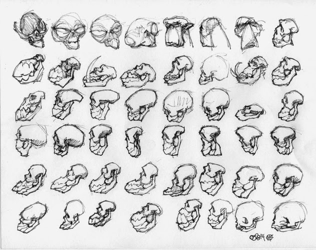 |
| 03/29/14 Skulls - 1" thumbnails |
There are at least two ways to vary any element in a thumbnail, usually more.Try all the variations you can imagine: up, down, left, right, diagonal, big, small, curved, flat, straight, crooked, etc.
Don't worry about the fiddly stuff. Simplify, get to the heart of the idea, play around, have some fun, and get creative! You may be surprised at the cool things you come up with - I constantly am!
This exercise is particularly useful for caricature artists. Combining exaggeration with minimization, amplification with understatement, is the heart of caricature. There are endless ways to push and pull features on the face. Playing around with features in a 1x1" grid can be a great way to get your creative wheels turning.
GRID 2:
I got the idea for this variation when I watched the video Environmental Design I with James Paick.
 |
| Environmental Design I with James Paick Click HERE to watch the video. |
 |
| More from Environmental Design I with James Paick |
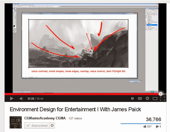 |
| More from Environmental Design I with James Paick |
Here is GRID 2:
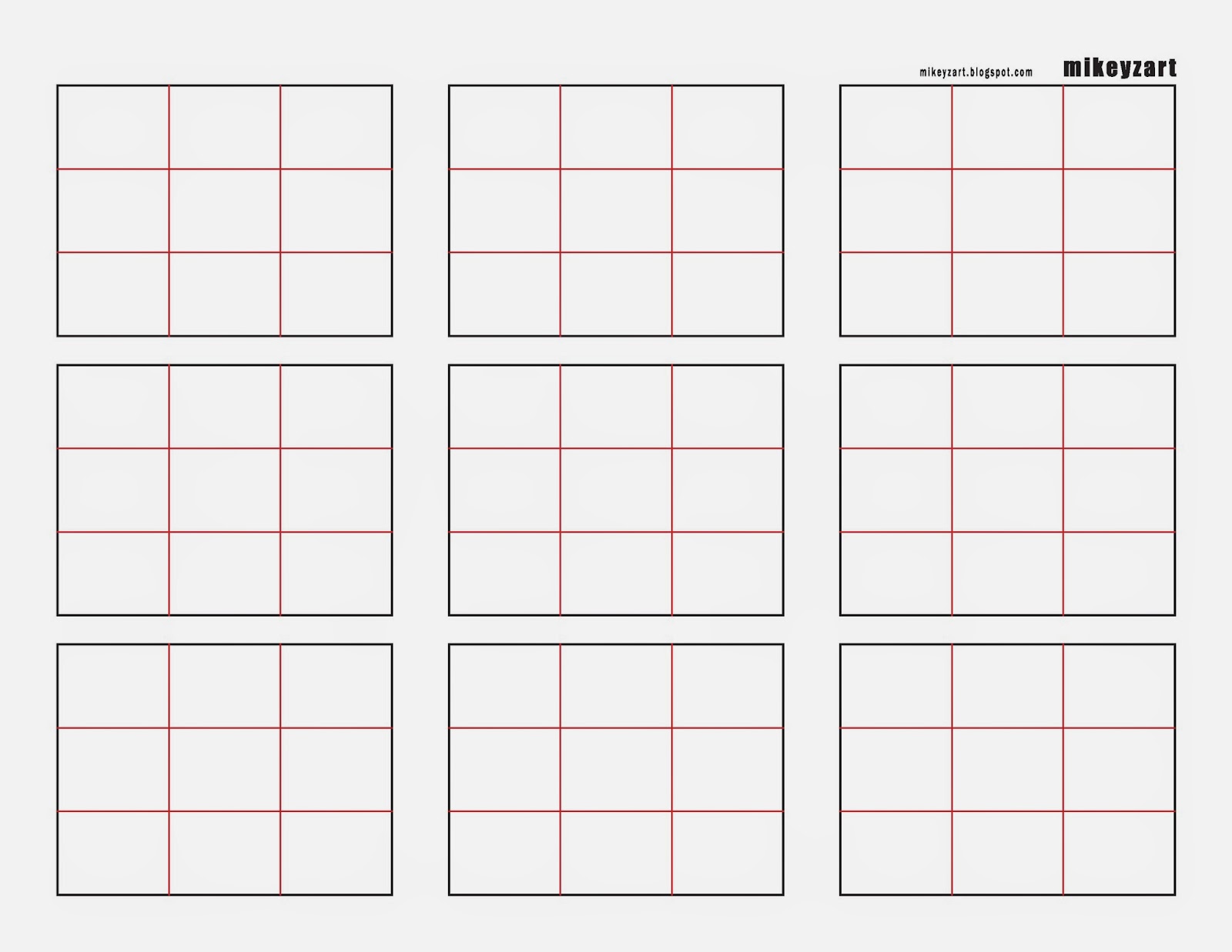 |
| Grid 2 - Color [Click HERE to open a printable .pdf file] |
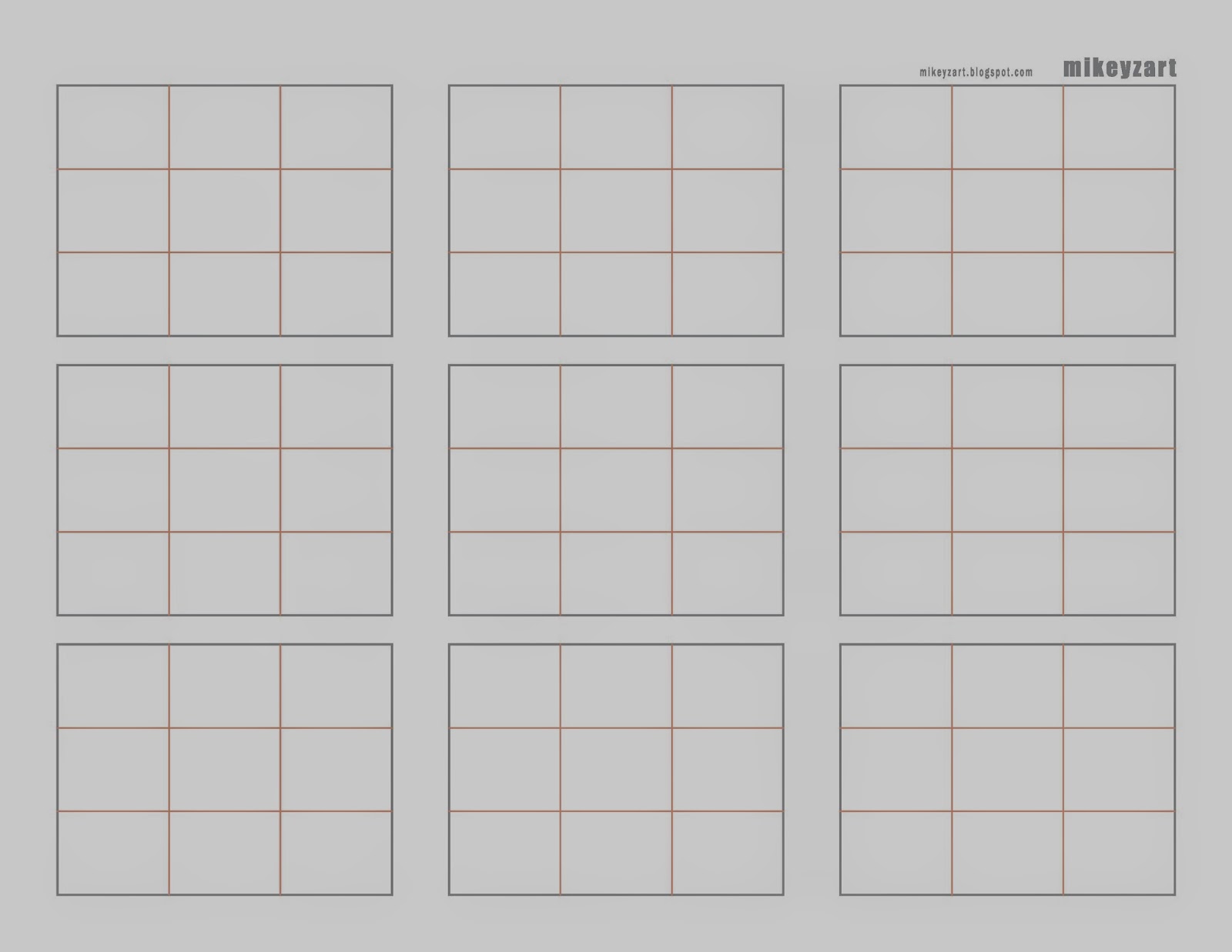 |
| Grid 2 - Gray [Click HERE to open a printable .pdf file] |
It's the same as with the 1x1" grids, but this version is better suited for working through compositional variations for a drawing or painting. Move elements around, vary the placement, size and shapes, etc.
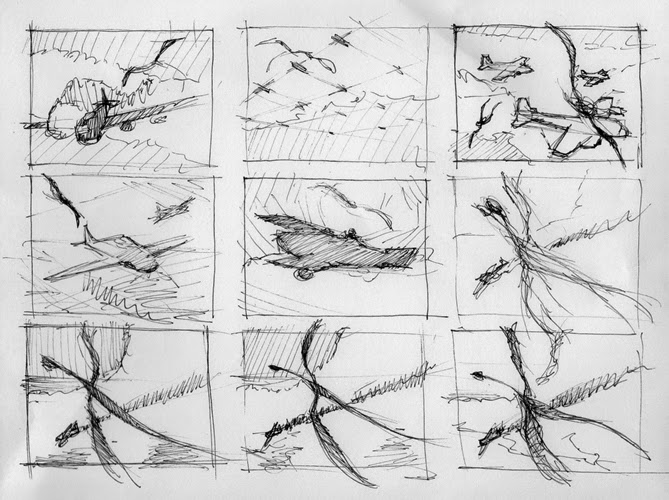 |
| A sample page of thumbnail sketches using Grid 2. |
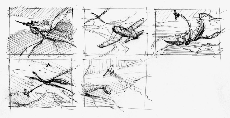 |
| A partial page of thumbnails using Grid 2. |
Once I worked with both Grids and got comfortable with them, I started to combine Grid 2 with smaller Grid 1-like divisions. This allows me to explore all kinds of layout variations - horizontal, vertical, varying diagonals, etc. You can even see where I filled a tiny horizontal space with a tiny panorama. I might never have tried it otherwise, but there was the space, so I gave it a go.
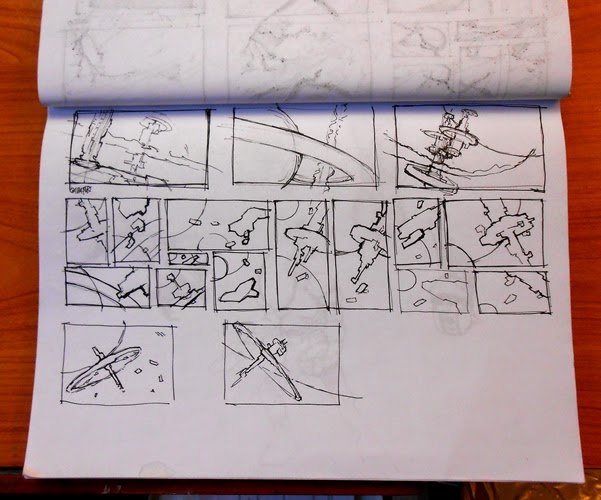 |
| Here, I've combined Grid 2 and Grid 1, breaking up the larger grid into smaller ones to work out variations. |
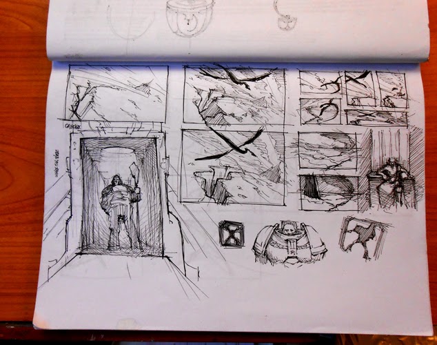 | |
| Using Grid 1 and Grid 2 together - a fast way to get a lot of ideas down. |
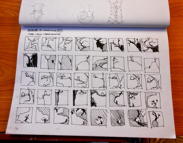
He tried as many variations as he could using three elements: A tree, a rock, and a building.
I took the idea and tried it with a tree, a rock, and a human or animal figure.
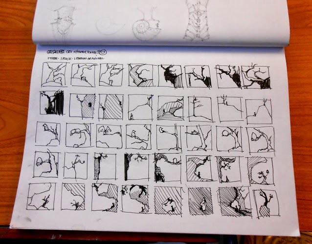 |
| Grid 1 - three elements: -Tree -Rock -Figure (human or animal) |
Then I saw a picture of a man standing on top of a gigantic tree stump. So I tried the idea with a stump instead of a tree. I varied the grid to accommodate horizontal and vertical compositions, etc.
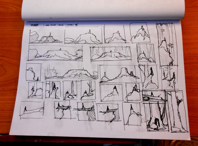 |
| Three elements: -Stump -Rock -Figure (human or animal) |