All art copyright (c) Mike Kloepfer
"The level of achievement that we have at anything is a reflection of how well we were able to focus on it."
-Steve Vai

Monday, December 27, 2010

Color Charts: Mixing it up!!!


Continuing on with the Color Charts...
*(NOTE: The camera is really not picking up the colors very accurately. Trust me on this one...)
First up: Do the same mixtures of the raw colors, only this time using Zinc White.
After the masking tape is pulled, the two mixtures will be side-by-side. The Zinc White is warmer than the Titanium, and more transparent. At this point, I have only mixed the first (raw color) column in both TItanium and Zinc, as the paint needs to dry before I can mask over it.

Next step: mix each base color with each of the other base colors, and down to white - keeping the base color slightly dominant. This means that for each color mixture, there will end up being two versions, one leaning slightly to one color, and one leaning slightly to the other. For instance, in the Red Oxide chart, the Red Oxide/Yellow Ochre mixture is influneced slightly more by the red. On the Yellow Ochre chart, the same mixture will lean slightly to the yellow side.

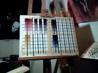
In this step, I begin with the base color for the chart. For instance, in the upper left is Red Oxide. The first column is the raw color, mixed down to almost-white with Titanium. Next to it is the same thing with Zinc.
The following columns are Red Oxide mixed with Yellow Ochre; with Burnt Umber; with Payne's Gray; and with Manganese Blue Hue. These are then mixed down to white; first Titanium White on the left side of the column, and when that dries, with Zinc White on the right side of the column.

It may seem tedious, but in the end I will have each color mixed with each of the other colors, with two versions, one dominant in each of the colors; and each of these colors will be mixed down to almost-white with both Titanium White and Zinc White. (Besides, I am a pretty tedious person anyway. lol )
I will have a pretty good idea of what each color in my palette is really cabaple of. And, I will have a handy reference of simple color mixtures and simple, rich neutrals, with a certain degree of built-in color harmony.
In addition, I will be able to look at photos, videos, movies, and TV shows, and decipher how their color schemes work, and how I could mix up similar color schemes with my palette.

For instance, looking at this picture of Loreena McKennit I can already begin to see the simple color combinations of two dominant colors: Payne's Gray and Yellow Ochre; and how the dominant colors can be modulated with Red Oxide, Burnt Umber and Manganese Blue.

And here is what started it all (this time, at least)-

When I saw these scenes from the TV series Merlin, I could immediately identify a cool/warm, Blue/Orange dominant color scheme in which Payne's Gray and Yellow Ochre/Red Oxide could easily be used as the primary colors. Very simple, very powerful color schemes. And they work.

Sweet.

And what a coincidence that I had switched my palette over to these exact colors! (Or is it not coincidence, but the guiding hand of fate...?)

There was another scene in Red/Green, and trying to figure out what colors to mix to get those dominant colors was what started me experimenting, and ultimately led to these color charts.

Sunday, December 26, 2010

Hello, my name is Mike, and I am a paint geek.

I have a problem.
I like to make color charts.

Yes, it's true. I probably get into this stuff way more than I should. I should be making beautiful paintings, not messing around with this stuff.
Blame Tony Ryder. He had us mix every color on our palette with every other color. You know what? It learns ya. Some of the resulting mixtures were surprising. I found out that you can create an exact Yellow Ochre by mixing Chartreuse and Brilliant Pink.
Or blame Richard Schmid. He recommends doing the same thing, and expands on the idea by mixing each color mixture down to almost-white... and I took his advice (see above.)
Or blame my dad. He showed me the value of being a craftsman (as well as an artist.)
Sure it seems crazy. But that's how I get INTO the paint, how I get inside it; it's how I get a feel for what it can do. It's how I get to know my tools. It's like taking a great sports car for a really in-depth test drive. I really enjoy it. It gets me jazzed to see the colors happen right in front of my face.
And it sharpens my ability to mix colors on the palette - simply and cleanly.
And god knows I need that. If left to my own devices, I would throw every color for which I had a tube of paint at any given mixture; and then wonder why it looks mucky. I mean, they're all beautiful colors in their own right, yes? So wouldn't they look GREAT all mixed together?
LOL
That is how my brain works. That's also how I wind up lost in the middle of the "Technicolor Melty Jungle."

And this is my thinking process, how I figure things out; because I have a driving need to figure things out. I am not satisfied to just let things happen by chance; I have to know why they work when they do, and what went wrong when they don't.
So forgive me if I walk out of this support group. You can join me if you want. But I am content with knowing myself, and how I work, and going with that.

So here we go... color charts!
...with my newly concocted 'limited palette'
(Red Oxide, Yellow Ochre, Burnt Umber, Paynes Gray, and Manganese Blue Hue; from the line of 'Open Acrylics' by Golden.)
First we start with the raw colors of the palette, and mix them with Titanium down to almost-white in five steps...

Saturday, December 18, 2010

Sick days don't always suck.


Stayed at home today, sick as the proverbial dog.
I was vegging and watching some tv (Merlin), and all of a sudden, I could see the exact colors, and the color palette, that they were using. It was as if they pulled the colors right off my newly acquired "limited" palette (Payne's Gray, Red Oxide, Yellow Ochre, Burnt Umber and a touch of Manganese Blue) that I just hand-picked at the art supply store last week.
So I got my new 'limited palette' selection of paints and played around with them. I find that by doing simple mixtures, blends and washes, I can really get a feel for the colors in my palette, their strengths, and what they are capable of.
Plus, since I had already written the day off as a sick day, there was no hurry or agenda (i.e., I didn't feel the need to 'accomplish' something.) That allowed me to just experiment and have fun.
I found that this palette is quite powerful and versatile, and I can create nearly everything I need for the pieces/color schemes I have in mind, while maintaining color harmony. I also am experimenting with the two whites: Titanium and Zinc, and how they affect the colors.
I love the way the colors play off each other. And in the tv show, I could see the way they composed the scenes with color and lighting. It gave me a lot of really cool ideas.
It was quite the extraordinary experience.

In addition, I prepared a couple of sheets of canvas for the next step - the color charts!
I take each color in the palette, and mix it with each of the other colors in the palette. I then take each of these colors and mix them down to almost-white in five steps.
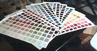
Here are the old color charts from my full, extended palette:

This really gives me a handle on all of the color mixtures and possibilities in my palette.
It also helps when I sit down to create a painting - I can look at a color I need, and find a mixture on the charts; it usually only needs minor tweaking to get the color I want, and helps me to keep my color mixtures simple. (I have a tendency to get carried away, and throw everything under the sun into a color mixture, only to have it come out looking like muck.)
I find that most of the colors I seek fall into the 'subtle grays'/neutrals - and by obtaining simple, clean neutral color mixtures, it makes the few saturated colors really sing!
It doesn't t always have to turn into a full-spectrum color Luau, like "Technicolor melty jungle"in the Burn the Ships cover/poster art!
;)
Fun fun fun!

Tuesday, December 14, 2010

NEW BRUSHES!!!


I am LOVIN' these new pin striping brushes!
My friend Jim has been urging me to try my hand at custom bike graphics. So, I bought some supplies; a couple 'sword' brushes by Mack, some One-Shot, a bit of acrylic paint and some poster board for practice.

These things kick a**!! By properly loading the brush, I can get seemingly infinite lines, and I love 'rolling' the brush around curves and making swirls!
I can see this having many applications. Not only for custom bikes, but for guitars :D, snowboards, furniture, who knows what else!
You can see how much fun I'm having just goofing around with them:

The exciting part is the process of learning to control the brush, and the flow of paint, to get an even, consistent line. The challenge is to not get dizzy.

And I can definitely see how this could apply to my fine art paintings. I am really gaining more and more interest in textures and patterns in my paintings. In fact, I have my eye on the deep blue sea background in this 'mermaid' painting that's on my easel, and I'm seein' some subtle, lines swirling all around her. Hmm....

Thanks Jim, for encouraging me into this new venture and all the possibilities that it opens up for me!

Tuesday, December 7, 2010

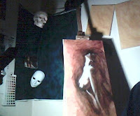
New figure painting - Mermaid/Surfacing(?)

(Finally, a pic. I had to use my webcam on my laptop.)

What is another term for something/someone coming up for air?

I dove back into the figure piece I started the other night. This one is vertical, and has a female figure emerging from the shadows (I am thinking of making it like she is coming up from the depths of the ocean to the surface...perhaps a mermaid?)

After throwing paint at the problem for a while, I stood back and looked at it. The proportions are crap (I should be ashamed of myself - have I thrown all my training, all sense of discipline out the window?), but the drama is there.

Well okay, 1 out of 2 ain't that bad, and I can always go back in and correct the proportions. (My goal is accuracy AND drama together...)

I am liking the drama of the light on this one. I have been really attracted to figures and portraits that are lit from directly above - the shadows are dramatic, and the highlights/drama get more intense as you go up the figure, getting closer and closer to the light source.
The original reference photo really grabbed my attention - hopefully, I can convey that initial spark. That is the beacon that I use to guide the painting process.

New stuff

So I got a wild burr under my saddle the other night, and got a few canvases primed and covered with a warm wash.
I am finding that what used to be regular size for me (9x12") is now incredibly small. The smallest canvas I prepared is an 11x14", and that is for a portrait study. The larger ones are 16x20 (which is not as large as I want to get) and the vertical ones are 15x30... which has really piqued my interest lately.
I like the vertical format, it fits the pieces I am visualizing at this point. Most of them deal with flight, or with emerging (from the deep subconscious) - or even with acrobatics, and so the vertical picture plane has my muse all wound up.