All art copyright (c) Mike Kloepfer
"The level of achievement that we have at anything is a reflection of how well we were able to focus on it."
-Steve Vai

Sunday, December 30, 2012

Cover art for FABLE by Lisa Fender

I am really enjoying my latest commission: front and back cover art and interior illustrations for the fantasy novel "Fable" by Lisa Fender and Toni Burns.
Here is a sneek peek:
WIP: Front cover for
"Fable"
by Lisa Fender
WIP:Inside map for "Fable"
by Lisa Fender

Monday, October 15, 2012

SALVADOR DALI Original Painting SOLD!

Congratulations and heartfelt gratitude to Christy Boerckel, who just purchased the original painting of
Salvador Dali:
Salvador Dali
Acrylic, 8x10"
Collection of Christy Boerckel


Christy is an avid art collector and fell in love with the painting.
It is always rewarding when my artwork strikes a chord with an art appreciator.

Tuesday, September 11, 2012

Public Image 2012 Art Walk and reception @ Anam Cara Gallery

Finished hanging my
new pieces for the show!
Friday, September 14 6-9pm -
Art Walk/Reception for "Public Image 2012" at Anam Cara Living Arts
445 S. Saulsbury St. Studio G
Lakewood CO 80226

You are invited to enjoy the art walk in Belmar's Block 7 Art District. Feel free to drop in and say hello... I have over 24 pieces in the show, over half of them are brand new!
Hope to see you there!

Monday, August 20, 2012

New pieces - Music Legends

Continuing my series of Musical Legends...
I have expanded the catalog to include both living and deceased musicians...
Some faces are just too much fun to resist!
Prints are now available in 8x10" and 11x14" of the following:

Kurt Cobain (Revised)
(Nirvana)

John Entwistle
(The Who)

Keith Moon
(The Who)

Ian Paice
(Deep Purple/Whitesnake)

Joey Ramone
(The Ramones)

Bob Marley

Janis Joplin

Steve Marriott
(Small Faces/Humble Pie)

Roy Orbison
(Travelling Wilburys)

Rick James

Ronnie James Dio
(Rainbow/Black Sabbath/Dio)


Gallery Show at Anam Cara

My art is featured in the show: Public Image 2012 at Anam Cara Living Arts Gallery in Belmar (Lakewood, CO),
along with work  by Carrie MaKenna and Craig Rouse.
The show features some of my favorite paintings, along with several new pieces -
and lots of PRINTS!!!
The show runs through Friday, September 14.
I will be at the gallery for the show's closing party on the 14th.
In the meantime, drop by the gallery, say hello to Carrie and Craig. and view the artwork!
Here's a quick view of the wall -
Just after we finished setting up the display.
Many more pieces are also available at the show as prints. 

Tuesday, April 17, 2012

Mermaid...W.I.P.

04/17/12
I need to STOP repainting the sky. Five times is enough!
FINALLY, by adding Cerulean Blue to my palette, I am getting the colors I want.


Monday, April 2, 2012

MO' BEATLES


Experimenting to see if I want to use Oil for the Humorous Likeness paintings.
I had an idea the other night for the Fab Four, to do each member in his own variation of a B&W color scheme, a takeoff on Kruger's paintings of Keith Richards in blue-gray, with one accent color. But what colors? Then it came to me - use their names as the cue:
Red for Ringo
Purple for Paul
Green for George
...and of course... John Lemon.
LOL
So here's a little test. Originally, John was the most difficult to 'get a handle on.' I was NOT going to paint John in the New York t-shirt (that has been done way more than enough times already.) Yesterday, I was looking at photos, and this one jumped out at me. Suddenly, I could see what I wanted to do with it. So, I gave it a try.
We'll see what happens with the color scheme, the idea is good but the implementation needs some tweaking.

KEEF ... Revisited


Yup, it's about time I got back into this painting.
After meeting with the crew from LOL, and looking forward to a spectacular summer, I felt the inspiration return.
I really liked the 'other' sketch of KEEF, and decided it would make a better painting in the end. (I can see why Sebastian Kruger painted him so often, he has a fantastic face, so much 'character...')
I covered over the old block-in (see it HERE) and started a new sketch. I'm thinking I'll continue with Acrylic for the humorous paintings for the time being, although I'm experimenting with Oil for these as well.

Weightless – the painting – an idea?

I've always thought that the drawing “Weightless” would make a great painting.

The basis of the idea is good, but in order to turn it into a painting, I feel it needs a little extra 'something.' We have the sky, and the figure; I believe that 'something' is a third element – something for the figure to interact with. She has an expression like she's enjoying the sunshine on her face... or she might be inspecting – or just looking at – something floating in front of her in the air. (Or perhaps something was already there, and is checking her out...?) The challenge is to figure out what that other element might be.

So I'm sketching and playing around and thinking about it, and wondering what that extra element would be... I think it should be something that is unexpected (kinda like a woman floating weightless above the clouds...) It should, however, make sense in that 'alternate reality' if you catch my drift.

Some of the ideas I came up with were pretty much what you'd expect: a bird, or a butterfly, perhaps? A hummingbird seems kinda cool. How about a balloon, or a kite? A goldfish?

Each idea creates a different 'story' to the picture. However, I think that most of these ideas are kinda what you'd expect. That one great element is still out there somewhere...

My sister had a good idea: a miniature globe (of the earth.)

Hm... need to think on this one a bit....

More studio developments... the palette


I'm trying out a combination of ideas that I've seen over the years. The Lexan palette is from Richard Robinson and Barry John Raybould from the Virtual Art Academy. they also suggested painting the backside a middle gray.

I had tried the idea of the Lexan palette earlier, but Acrylics just dry too fast, and it wound up being more hassle than help. Painting in Oil is a different matter, and I decided to revisit the idea. Placing the palette vertically came from an article I saw on David Jon Kassan. In my small studio area, I have to maximize my efficient use of space! So I am utilizing a second easel for the palette.
The benefit is that the palette receives the light from the same angle as the painting, and there is less discrepancy between the two.

So far so good. It is nice not having the glare from the lights on the palette (when looking down onto the table top.) I also like being able to easily clean the palette between sessions, or even between mixtures. And this one is big, has plenty of room.
I'll see how it goes, and post progress...

Color Charts in Oil


Now that I am digging into painting in oil, I have run into some issues with mixing colors. I found that if I'm painting the sky and sea, I simply need to have Cerulean Blue on my palette. I tried to mix it from other colors, but never was satisfied with the results. The straight tube color, when mixed with white, is so close to what I see as one of the major colors floating in and out of the sky – especially the skies I saw in Florida and the Caribbean. It also works for the skies in Colorado, although the colors tend to lean a little in the other direction, depending on the time of year and what altitude you're at. The skies of the Pacific Northwest tend toward the neutrals and grays, and California has its own personality as well.
As I traveled and moved around the country, I was fascinated with the way each sky has its own distinctive 'personality.' A good friend of mine who is a web designer said that when he moved From Seattle to Florida, his palette changed. He started using more aquas and oranges, because those colors were now so prevalent in his everyday reality. How true.
I spent a lot of time just looking at the sky and clouds, analyzing the hues and shades, and just getting a 'feel' for the color of the sky and the distinctive quality of the light. I could do that for days. I was particularly captivated by the skies in Florida, the way the clouds build up between the Gulf and the Atlantic, and the feel of the light and the atmosphere. I would drive down the highway with my camera on the steering wheel. One day I decided it would just be better to pull over and take pictures, then get back on the freeway. Good idea! LOL
Mixing Cerulean with French Ultramarine gives that perfect variation that makes up the bulk of the sky colors. Of course, there are countless variations, but I see those two colors as 'anchor colors' that the others are played against.
I could be wrong, but I don't care. It's my reality. I'll go with this until I witness something that convinces me otherwise... and I know it's probably out there waiting for me. LOL
I also really like the way the two colors vibrate against each other, especially when they are very close in value. Anything in addition to that is simply icing on the cake... (mmmMMMmmm...) Or perhaps a more accurate analogy would be that those two colors are the basic ingredients, and additional colors and variations are the spices.
I love blue. That's just the way I am.
So I picked up a tube of Cerulean Blue (Yes, HUE... it's what I could afford at the moment. I'll get the real thing in the near future when funds allow. Hey, some paint is better than no paint.)

So the next logical thing to do is to see just how these colors interact with each other, and to test out the mixtures in the range I am attempting to get in the ocean and sky of my current painting.
Even though I have done numerous color charts in acrylic, I understand that oil paints will interact differently, and I want to get more familiar with exactly how they interact.
All the color charts I have done in the past have led me to refine and develop my ideas for organizing my approach to mixing color, to help make sense of the way the paints interact with each other, and to just get more mileage with the palette knife, to improve my ability to mix the colors I want. Otherwise, it gets simply overwhelming; after several colors get thrown into the mix, it gets hard to tell exactly what is going on.
I have come to the conclusion that the best way is to get as close as possible with an initial mixture of two tube colors, and to modify and tweak that mixture slightly to get the exact color I'm looking for.

Last summer I developed a chart for mixing between two raw tube colors, then mixing those up to a very light, near-white (number 1) value in a five-step scale. I added two steps of mixing the base mixtures with black, which gives me a full range of the way two colors interact. So this is the color chart I decided to use.

I started with the colors closest to what I was trying to mix in the painting. First up, Cerulean Blue and French Ultramarine. That takes it from the central Cerulean (which is slightly greenish) to the Ultramarine (which leans toward purple.) Next is to go the other direction (particularly for the ocean colors) and mix Cerulean with Viridian to get the Turquoise colors; then another with Cerulean and Naples yellow to get the greens.
Now I'm really starting to get a feel for the blues, greens and aquas in the sky and ocean colors.
What's next? Let's see... I need to get a handle on some of those neutral flesh tones, and then there's the colors in the clouds...
Eventually, I will do a color chart for every combination of colors on my palette. I think by then I'll have a pretty good handle on how to get very close to the color I want with as simple a mixture as possible. That's the goal, at least.

COOL JARZ!!!


I found these jars at my 'day job,' they were marked down because there were three missing from the package of nine. SCORE!
I had been looking for small jars: one for turps (specifically for painting,) one for Medium. and one for Retouch Varnish. They need to be small, just enough for when I'm painting. "Dirty turps" for brush cleanup etc can be seen in the big jar, but when using the turps in painting, I want them to be clean and 'undiluted.'
These jars are just the right size. As a bonus, they can either be set straight up, or at a 45-degree angle (see photos.)
SWEET!
Yeah, I know... but sometimes, it's the little things in life.

Wednesday, March 28, 2012

The Mermaid_W.I.P.

Detail Shots:

My palette... am I getting organized? :O


Progress shots of my painting, working title: The Mermaid oil on canvas, 18x24"

New piece in OIL!!! The Mermaid

Well, I've finally done it! I've decided to paint in oil again.
The working title: The Mermaid oil on canvas, 18x24"
(Yeah, I know... where do I come up with these crazy titles?)

I have to give a nod of admiration, appreciation and thanks to Duffy Sheridan, whose personal advice and online guidance has been invaluable. His work is downright breathtaking. Ever since I saw his piece "Promise of Renewal" in the ARC Salon Catalog 2006, I realized that his work embodies everything I aspire to in my own artwork. Links to his website and videos are at the bottom of the post*.

[Please forgive the poor quality and inconsistent quality of the photos. Some are from my cel phone, and some are from the webcam on my laptop.]

Read my recent travails with this piece, in a separate post HERE.
Follow photographs of the Work-InProgress HERE.

*Check out Duffy Sheridan's phenomenal artwork on his website HERE.
Check out Duffy Sheridan's YouTube videos HERE.

Being an artist - an emotional roller-coaster ride.

03/26/12

Being an artist is such a roller-coaster ride.

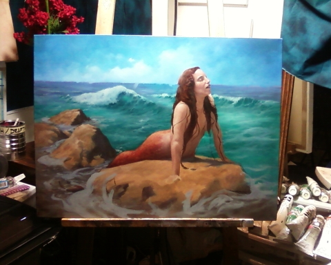
On Sunday I spent the majority of the day drawing and painting, and nothing good came of it, except in the end I decided to do some prep work for today. I did some sketching and drawing on an idea that I ]had that seemed spectacular (the sea nymph emerging from the seaweed and floating to the surface.) It was frustrating – I just couldn't get the composition to work, and I realized that I would have to do a gratuitous amount of inventing on the seaweed, and it was just looking hokey.

I did start to clean and organize the studio area a bit, which was good. Actually, I made a clean spot, and that got me going...

Today, I started by taking the prep panel and testing out how I was going to paint in the mermaid's fish tail. It worked well, so I set up the painting and began work. It was up and down – it looked good, then it started looking crappy, and back and forth... In the end, I was satisfied with how it looked, so I decided to let it dry and move to something else.

I painted in the section of the hair that I overlapped when I was correcting the sky (again...) [Click HERE to see what I'm referring to.] I was very happy with the way it was looking, and starting to 'see' the finished painting coming together. The lighting is working well, it's lookin' pretty good.

I took the hair as far as was feasible at this stage, and took a breather. Next I decide to continue on the (correction of) the distant ocean and waves.

I didn't see that I dragged my hand through the (wet) hair, and next thing I know, I have a great big smear of super-saturated burnt sienna right over the beautiful fluffy white clouds and sky (that I had just corrected – again – two days ago.)

Now, not only am I panicking and wiping off the reddish brown blobs on the sky, but I see that the hair (which was looking really good) got all smeared when I dragged my hand through it.

* sigh *

LOL

Oh well, I did a bit of repair work, and I'll have to fix that bit of sky once it's dry – that burnt sienna is just too strong a color to paint over if it's even slightly wet; it'll totally screw up and over power any paint on my brush. So I'll wait until it's dry and fix the sky.

The good news is, in the process, the color in the hair got a bit more 'daylight-ish', and the edge where the hair meets the sky, and the turning form, may actually work out better in the long run.

I try not to get too caught up in the emotional highs and lows – I'm just along for the ride. I am constantly making decisions on what to do here and what to do there... it's just another decision to make.

:)

The Musketeer - WIP

Some progress shots of The Musketeer, Acrylic on Canvas, 16x20"


Check our my original compositional analysis HERE.