All art copyright (c) Mike Kloepfer
"The level of achievement that we have at anything is a reflection of how well we were able to focus on it."
-Steve Vai

Friday, December 30, 2011

Fun with analysis... The Musketeer

A new piece, The Musketeer.
I have the sketch looking how I want it. Now I am using the armatures of 3 canvas sizes, experimenting with the placement of the figure within the picture plane. My computer graphics skills allow me to experiment endlessly, and see how each configuration looks. I am grateful for the opportunities and advantages modern technology offers.

It's interesting to see how each arrangement tells a unique story. For instance, look at how and where the eyes are placed in the following examples... or how on some the chin rests firmly on the diagonals... What is contained in the shapes created by the diagonals? What major outline shapes fall along the diagonals? What happens at the intersection of diagonals? What story does that tell? How does it change the meaning of his expression, gesture, body language? These are the questions I am asking myself as I experiment, move the figure around, make it larger or smaller, etc.

It may be a while before this becomes a finished piece...

15x30"


16x20"

18x24"

Saturday, December 3, 2011

Color Study - "Temperature"

12/04/11:

A slightly more accurate color correction.

12/03/11:

Acrylic, 5x7"
After watching a documentary on Polar Bears, I had the idea to do a small color study contrasting the cool shadows on the snow with the warm sunlight hitting the polar bear's fur; a metaphor for the contrast of the warmth of the sun against the cold, vast expanse of polar region.
Not surprisingly, I call this study "Temperature."
The color on this scan is as close as I could get to the actual painting study.
Did you ever have one of those times when you didn't quit while you were ahead? Yeah, I know.
I pretty much had the colors and values dialed in about halfway through, but I kept going. Pretty soon, I was trying to correct what I had done to the original sketch...
There is a point where you don't go back in and 'fix' things, or you'll spend more time fixing your 'fixes' - this is one of those times.
Still, it came out okay in the end, I got to exercise my color and value-matching skills, and I learned from the experience.With a color study, it's not about producing a finished piece, it's about learning and honing the skills of perception and execution.

Friday, December 2, 2011

The Lady In White-Revisited

12/02/11:
You know how some ideas sit around for a long time? I had the initial inspiration for this painting The Lady In White a couple years ago. I liked the idea, but it needed something more, in order for it to really come alive. So I have been sitting on it (like a bird on an egg,) waiting for the right inspiration and ideas.
Lately I have been gathering ideas to continue my series of paintings of (costumed) figures in nature, and percolating on the concept for The Lady In White. The one thing that the piece needed was the right environment/setting. Last night while watching a documentary movie, I saw a background that had just the right 'feel' that I was looking for. I really liked the quality of the light, and the way it filtered through the forest. I knew the light in the forest would compliment the light on the figure, and the stream was just the right extra element to bring it all together.
So this morning, I spent some time gathering reference material, and by this afternoon had enough to begin the sketches. I started with thumbnail sketches of the composition, but quickly realized that I needed to get a feel for the colors, the quality of the light; then I could make better decisions about the composition. Plus, it was the colors and the light that had me excited, and I needed to follow through and tune into that while the inspiration was fresh.
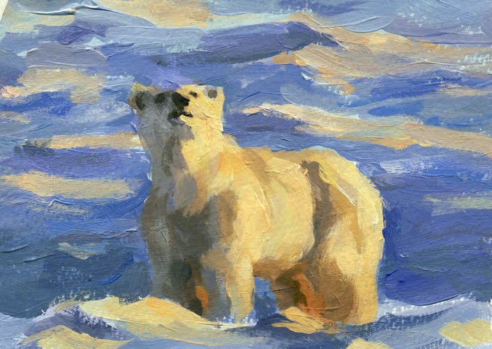
I did this little color study.

Acrylic, 5x7"
The idea of the study was to work out some of the details of the working process. For instance, to set the sky color, and the foliage behind everything, then build toward the front in layers.
This took a couple passes, and I completely painted over it and started again with a better running start.
The most important thing I learned from the color study is the color choices when progressing from the background forward. In the early stages, I had to reach for the neutral colors when mixing: Raw Umber for yellows, Black for cools, Burnt Umber for reds. That way, as I moved forward, I had plenty of 'room' to move into more earthy tones, browns and greens, reaching for the Yellow Ochre, Ultramarine and Burnt Sienna, without getting too saturated. I still have a focal point - the figure - to place into the composition.
Now, to figure out where and how to place that figure!
Here is the drawing of the figure:

For the back-story on the piece, check out the blog post HERE.